August 7th: An economist reader made two fair points about this analysis. A store's own margin can fund part of a discount before any subsidy is needed. And construction money is not an ordinary expense, because the city ends up owning five new stores it could someday sell. The model now carries both directly. The stores' margin funds about four points of the storewide discount, and taxpayers fund the other fourteen point for point. Changing the comparison with plain cash would take selling the stores in year ten for roughly what they cost to build. The math is in the methodology notes. The verdict does not move.
Mayor Mamdani's five city-owned grocery stores are coming together. Since my April piece, the administration has published a vision plan and a 44-page operator RFP (due October 16), and named The Peninsula in Hunts Point as the second site after La Marqueta. The Peninsula opens first, in late 2027.
The plan is audacious and spectacular. It is also, as I wrote in April, a uniquely inefficient way to feed low-income New Yorkers. But implementation design will have a strong bearing on the policy's success.
The stores will sell a core basket of groceries at 30% below market prices. No one has published what that promise will cost to keep. So I modeled it. Including the $70M the city has budgeted for construction in fiscal 2027, the five stores will cost about $167M over ten years, and the discounted baskets will reach roughly 12,000 households. Spent in other, simpler ways, the same money could deliver discounted food to between 70,000 and 180,000 households.
The City Sizes the Discount
On July 27 the administration put the first hard number on a campaign promise of "wholesale prices". A core basket (all fresh produce, meat, and seafood, plus about twenty categories of dairy, pantry staples, and deli items) will sell on average 30% below market, with no income test. Prices reset monthly and will be the same at all five stores, per the RFP. The "on average" comes from the vision plan, and it means the 30% is measured across the whole basket, not item by item. City Hall's own arithmetic says that cuts the average total grocery bill about 15%, or $90 a month.
The headline is triple the 10% my April model assumed. Blended across a whole store, call it double. My central case puts the basket at 60% of sales, inside the official record's 40–80% bracket, for an 18% storewide discount. And it makes sense. A municipal store that's 10% cheaper doesn't feel special. At 30% off, for the people who can get it, it is the rent-controlled apartment of food. Very few get one, and those who do get a big deal.
Who pays
The RFP structures operator compensation as annual "affordability payments" sized to the operating deficit the discount creates after the free rent and waived property taxes are counted, on top of the city-funded buildout. The size of those payments is a bid variable: operators name their own subsidy requests and the city scores them. A supermarket run as well as the best private grocers nets one or two cents on the dollar, so its own margin can fund one or two points of discount. Spared rent, property taxes, and construction, these stores can fund about four. Every dollar of discount past that line is a straight cash transfer from taxpayers to the shopper at the register. Nowhere in the public record is there an operating-subsidy number. Neither the vision plan nor the 44-page RFP contains dollar figures, and the adopted budget leaves the operating line unstated. The city has priced the construction ($70M, all fiscal 2027) and left the recurring bill to the operator selection in early 2027. This model estimates the bill.
The new bill
Stores selling food at 30% below the market rate should be very busy. Deals this good make a trip worthwhile! Grocers measure busy in dollars of sales per square foot of selling space each year, and FMI, the industry's trade group, puts the national average at $1,019. My central case assumes the city's stores at least match that. It is probably still low. New York's small, high-rent stores survive by ringing up more per square foot than the national number. Busier cuts both ways, reaching more households and losing more money. The loss is simple arithmetic. Costs other than rent eat 93 cents of these stores' sales dollar, and an 18-point discount turns the 7 cents left into an 11-cent loss on every dollar sold. At the RFP-consistent store sizes, that is about $1.9M a year per store, and the ten-year envelope comes to about $167M, two-thirds more than the $100M my April model implied. Other official documents give different store sizes, which moves the bill between $156M and $173M. If the city instead paid operators the full discount, it would run closer to $197M.
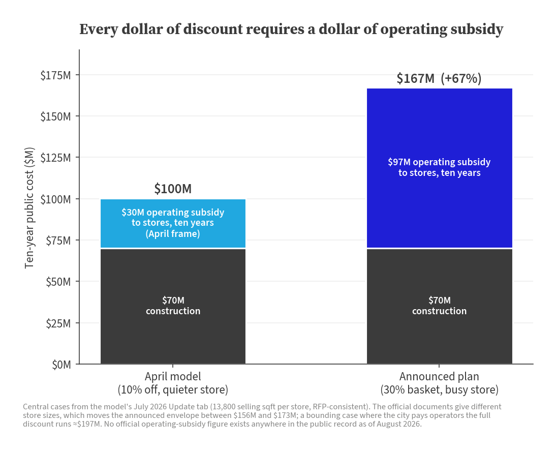
This is a prodigious number. The city is spending $167M to address food access for low-income New Yorkers. The problem is how few of them it will reach.
Better per dollar
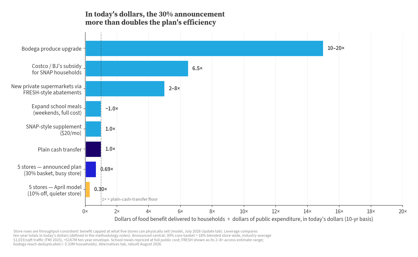
I judge every option here by one number. Dollars of food benefit reaching households per dollar of public money spent, counted in today's dollars. How that counting works is spelled out in the methodology notes at the bottom. Plain cash scores 1.0× by definition, so that is the floor any program has to beat.
There is a real case for a deeper discount. For the people it reaches, it is large enough to matter, and it uses the stores more efficiently. The announced plan scores 0.69×, 69 cents of food benefit delivered per public dollar spent, up from my April model's 0.30×. But the ceiling on that improvement is structural. Past the four points the stores' margin funds, every point of discount is benefit and cost at once, a dollar out of the treasury arriving as a dollar off a receipt. That is a direct transfer wrapped in a grocery store, and the wrapping is expensive: about thirty cents of every public dollar goes to building and running the stores rather than to cheaper groceries. A discount can approach what plain cash does and never beat it. Traffic does not change that until sales clear about $2,200 per square foot, busier than almost any grocery store in America. Even permanent stores stay under it once replacing their worn-out shelves and refrigerators is priced in. And the buildings do not rescue the math. Sell all five stores in year ten for $30M and the ratio reaches 0.80. To reach the cash floor, the city would have to sell them for what it paid, as if a decade of wear cost nothing.
A big benefit for a small few
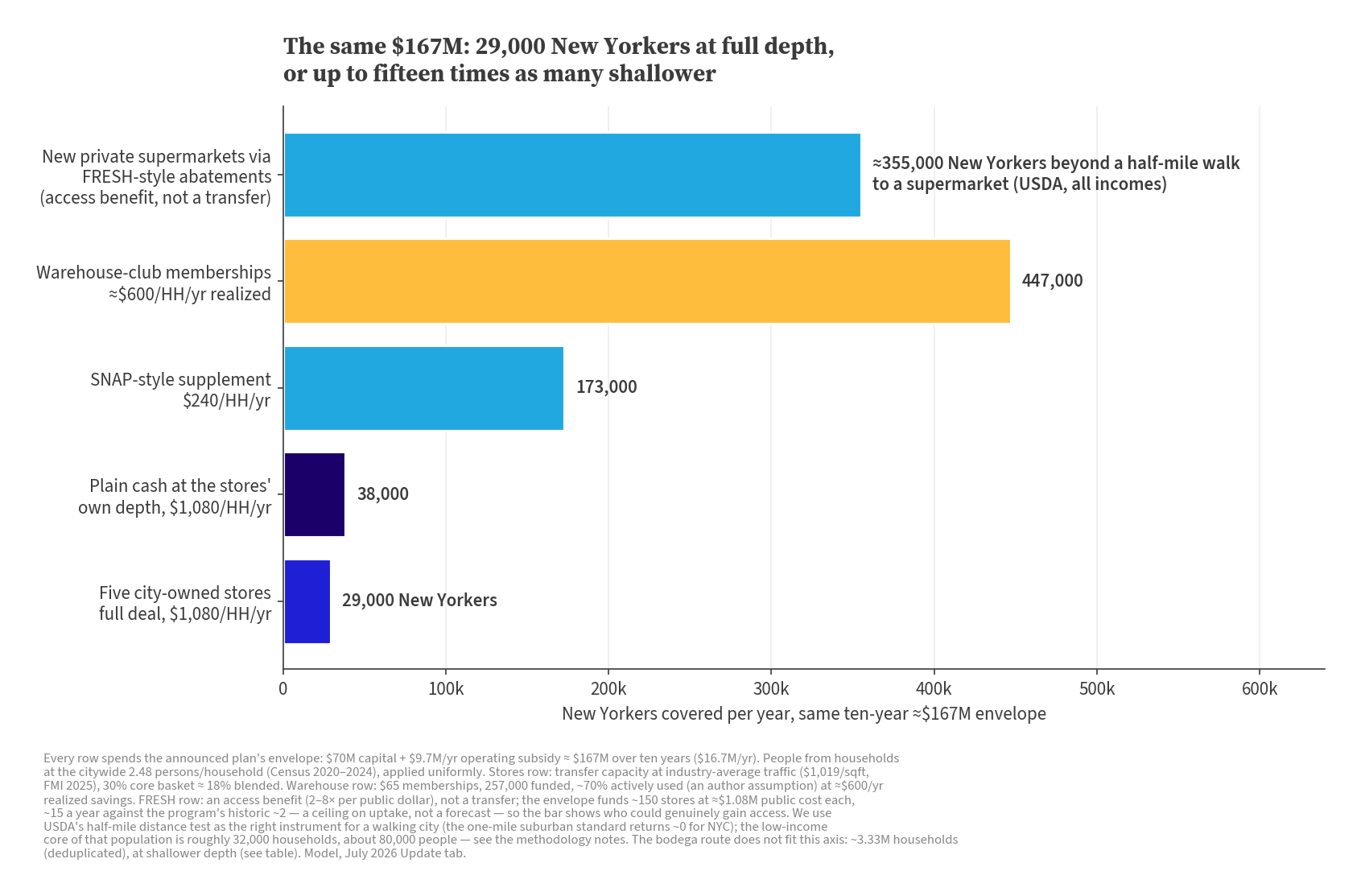
It comes down to reach. The five announced stores can move about $13M a year in discounts. At the promised $90 a month, that is roughly 12,000 households getting the full deal — call it twelve thousand, selected by who gets to the store and through the line. Twelve thousand households is about 29,000 people, at the citywide average of 2.48 New Yorkers per household (Census). I use that same conversion for every number below. Hand the same money out as plain cash in the same $90-a-month portions and it reaches 38,000. A SNAP-style grocery supplement at $240 a household reaches six times as many New Yorkers as the stores do, and warehouse-club memberships at roughly $600 of realized savings reach fifteen times as many — 173,000 and 447,000 people a year. There is a trade-off between reach and depth. A warehouse-club membership is not a 30% basket, so helping fewer people more is a legitimate choice. For $167M, five city-owned grocery stores are a policy at the extreme end of that trade-off, totally favoring generosity over breadth.
| What ≈$167M buys over ten years | Covered each year | Depth per household per year | Per public dollar |
|---|---|---|---|
| Five city-owned stores (announced plan, central) | ~12,000 households (~29,000 New Yorkers) | $1,080 | 0.69× (price transfer) |
| Plain cash at the same $90 a month, no stores | ~15,500 households | $1,080 | 1.0× (cash) |
| SNAP-style supplement | ~70,000 households | $240 | 1.0× (cash-like) |
| Warehouse-club memberships | ~180,000 active (257,000 funded) | ≈$600 realized | 6.5× (induced savings) |
| School meals on weekends | ~21,000 kids | ≈$790 in meals | ~1.0× (meals delivered) |
| FRESH-style abatements, scaled up | ~143,000 half-mile low-access households by year ten (~150 new stores) | ≈$300 for the low-access core | 2–8× (access value) |
| Bodega produce upgrade, scaled up | nearly every household (~3.3M) | $50–100 produce access | ~10–20× (access value) |
Assumptions and constraints behind this table
Rows above 1.0× lean on catalytic assumptions, spelled out in the methodology notes below. The FRESH row would run about fifteen new stores a year against the program's historic two — a ceiling on uptake, not a forecast — and its per-dollar range prices access benefits against the roughly 143,000 households (355,000 New Yorkers) that live beyond a half-mile walk to a supermarket on USDA's count, the distance test this model treats as the right one for a walking city — with the full ≈$300 reserved for the low-income core of that population, roughly 32,000 households. The bodega row's reach is capped at the city's household count rather than the April table's overlapping catchments. The school-meals row prices weekend meals at full public cost; summers are already universal.
Dial it yourself
If the stores instead run as quiet as a typical new small-format store — the $500 per square foot my April model assumed — the envelope falls to about $128M and the efficiency to 0.43×. Busy stores cost more and do better per dollar. Quiet stores cost less and do worse. Neither gets near the floor. The dial below runs the model's arithmetic on whatever assumptions you choose. Try to make the stores beat the cash-transfer floor. Under extreme assumptions you can (past about $2,200 per square foot), but even infinite traffic tops out at 1.64×, several times under the best shovel-ready alternatives.
| Central case | Value |
|---|---|
| Stores | 5 |
| Sales per square foot | $1,019 |
| Basket discount | 30% on 60% of sales |
| Annual subsidy, five stores | $9,734,210 |
| Ten-year public bill (capex plus subsidy) | $167,342,100 |
| Households receiving the full promised savings | 11,719 |
| People reached | 29,062 |
| Food benefit per public dollar (present value) | 0.69 |
Parting concern
A 30% below-market price with no income test is a textbook shortage setup. Expect lines, sell-outs, and profitable resale of the staples at a 30% spread. Officials are ahead of me here. NYCEDC floated a "library card-esque" system in July, and the RFP now spells it out: operators must prevent "excessive bulk purchases" and stand up a voluntary free savings card to monitor sales and implement the discount and any demand-management measures. The card can't be a condition of entry, and no numeric limit exists yet. At this point, the question of shortages is well-founded speculation, not yet arithmetic. Time will tell.
Housekeeping
The April piece stands, and both pieces now run on one upgraded model: a July 2026 Update tab with all of this as editable cells, plus a sourced implementation ledger. An August re-audit corrected three of April's assumptions along the way — the school-meals cost basis, the FRESH benefit math, and the SNAP household count — and the April piece's figures are updated accordingly, with a note. April's 10–15% discount framing was my reading of an unquantified promise, corrected the same way. The methodology notes below have the details. If a number here is wrong, tell me. joe@group17a.com.
Methodology
This appendix is for readers who want the joints of the model, not the headlines. It walks every load-bearing assumption in the August rebuild: where each number comes from, which reading I chose when sources disagreed, and what each choice does to the answer. The changes since April come first, because several are substantive corrections and I would rather you meet them here than discover them. Nothing below is needed to follow the piece, but every figure in the piece can be rebuilt from what is below.
What changed since April
The April post is corrected in place with a dated note, so the two pieces now run on the same model. The substantive changes, one sentence each:
- School-meals cost basis. April priced an added weekend meal at the $0.35 state top-up, and the rebuilt row prices it at the full public cost of about $4.91 per meal, which collapses the printed ~10× to about 1.0× (detailed under School meals).
- FRESH sourcing. The cost side is re-sourced to the Comptroller's Fiscal Note 4-2024 ($29.2M across 27 tax-subsidized stores, about $1.08M each) and the benefit side is rebuilt on the food-access evidence, which turns April's 30× into a labeled 2–8× range (detailed under New supermarkets and food access).
- SNAP household count. April's 692,000 "NYC SNAP households" was never an administrative household count, and the model now carries the administrative figure, about 1,069,000 households on OTDA's 2025 monthly series (detailed under The comparison table).
- Footprints. The central store size updates to the RFP-consistent 13,800 square feet, the reading of the operative document rather than the marketing pages (detailed under Store economics).
- Household conversion. People figures now convert at 2.48 persons per household, the Census 2020–2024 QuickFacts figure for the city, applied uniformly (detailed under The comparison table).
- The verdict's frame. The per-dollar ratio now reads in today's dollars, with benefit and cost both discounted at 4%, while the bill stays nominal (detailed under Frames and algebra).
Smaller updates are noted where they occur: FMI's 2025 traffic benchmark replaces the 2024 figure, the construction-cost multiple reframes to like-for-like tiers (roughly 3–6×, not April's 6–22×), and the warehouse-savings dollar figures are re-attributed as my conversion of published percentage wedges rather than as Consumer Reports figures.
Frames and algebra: how the money math works
The piece runs on two numbers, a bill and a verdict, and they live in different frames on purpose. This section walks the algebra so a reader can rebuild every headline figure to the cent.
The bill is nominal. The $167.3M is the sum of the checks the city would write: $70M of construction money, already a named line in the city's capital plan (FMS project "Citywide Grocery Stores," a single construction commitment planned for June 2027, per the FY2027 Executive Budget Capital Commitment Plan, Vol. 1, printed p. 167, and Capital Projects Database entry 801GROCERY), plus ten annual Affordability Payments of $9,734,210 at the central case. I do not discount the bill, because budgets do not. When an operating line eventually appears in a financial plan, it should be comparable to the number printed here. For reference, the same envelope is about $149M in today's dollars ($148,953,162.80).
The verdict is in today's dollars. The per-dollar ratio (the workbook calls it leverage) divides food benefit reaching households by public cost, both sides discounted at 4%. Present value in one sentence: a dollar the city pays or a shopper saves in 2036 is worth less than a dollar today, because the city can fund a future dollar for less than a dollar now. At 4%, a dollar ten years out counts for about 68 cents. The construction money is day-one money and the grocery discounts arrive over a decade, so an undiscounted ratio would misweight the two sides. Discounting them symmetrically moves the ratio from 0.756 (nominal) to 0.689, lower because the costs land earlier than the benefits. The piece prints both. The 4% is an assumption, pinned to where New York City municipal bonds have traded recently (roughly 3.5–4.5% in 2026), and the horizon subsection below shows what the answer does across that band. The whole discounting machinery is one number: a flat dollar per year for ten years is worth $8.1109 today at 4% (the annuity factor, carried in the workbook at full precision, 8.110895779).
Why discount the ratio but not the bill? They answer different questions. "What will this cost?" is a budget question, and budget documents are nominal. "Was it worth it against the alternatives?" compares dollars landing in different years, and that comparison only means something on a common date.
The central chain
Every headline number descends from one chain.
| Step | Value | Basis |
|---|---|---|
| Gross revenue per store | 13,800 sqft × $1,019 = $14,062,200/yr | Footprint: the RFP-consistent average, (15,000 Bronx + 9,000 La Marqueta + 3 × 15,000 assumed for the other boroughs) ÷ 5 (RFP Appendices D–E). Traffic: FMI's 2025 figure, $19.59 per square foot of selling area per week × 52 = $1,018.68 |
| Blended storewide discount | 30% × 60% = 18% | The announced basket discount times an assumed dollar share of sales (bracketed below) |
| Contribution per $1 of market-priced sales | (1 − 0.18) − (0.72 + 0.12 + 0.09) = −$0.11 | Cost of goods, labor, and other operating costs, each defended under Store economics |
| Operating result per store | $14,062,200 × (−0.11) − $400,000 fee = −$1,946,842/yr | The operator fee is a model assumption |
| Subsidy, five stores | 5 × $1,946,842 = $9,734,210/yr | |
| Ten-year bill | $70,000,000 + 10 × $9,734,210 = $167,342,100 | The piece's "about $167M" |
| Transfer to shoppers | 0.18 × $14,062,200 × 5 = $12,655,980/yr | Discount dollars at the register |
| Households at full depth | $12,655,980 ÷ $1,080 = 11,718.5 | The promised $90 a month, annualized. The release rounds to "$1,000 a year" and the model divides by $1,080 |
| New Yorkers | 11,718.5 × 2.48 = 29,062 | Census QuickFacts persons per household, 2020–2024, applied uniformly |
| Ratio, nominal | $126,559,800 ÷ $167,342,100 = 0.756 | |
| Ratio, today's dollars | ($12,655,980 × 8.1109) ÷ ($70M + $9,734,210 × 8.1109) = $102,651,334.77 ÷ $148,953,162.80 = 0.689 | The piece's 0.69× |
Two caveats belong here. The official footprint figures mix definitions (the Bronx unit includes a mezzanine, Appendix E specifies selling space), so 13,800 is the RFP-consistent reading, not a measured constant. And FMI does not publicly label its sales-per-square-foot statistic a mean or a median, so I treat it as a published benchmark. Operator selection in early 2027 will replace both assumptions with facts.
The blend, and why the basket share barely matters
No official document fixes the basket's share of sales in dollars. The record brackets it three ways, with three different denominators. NY1's report of an EDC board meeting put discounted items at roughly 40% of total offerings, a SKU count, hedged as a possibility and attributed to no named official. Errol Schweizer, a former Whole Foods grocery vice president and a consultant on NYCEDC's program, told FoodNavigator he expects core products to run 70 to 80 percent of the stores' volume, which counts units, not dollars. And City Hall's own July 27 arithmetic (30% off the basket cuts the average total bill 15%, per Mayor Mamdani's announcement) implies the basket is about half of an average household's grocery spend, since 0.15 ÷ 0.30 = 50%. The RFP quantifies nothing, but it builds the basket from all produce, meat, and seafood plus the top-purchased grocery categories by unit sales, which supports a large share. I center at 60% of sales: above the City Hall-implied 50% because demand at these stores should concentrate on the discounted aisles, below Schweizer's 70–80% because his estimate counts volume.
Here is the whole model at five shares.
| Basket share of sales | Blend | Ten-year bill (nominal) | Per-dollar ratio (today's dollars) |
|---|---|---|---|
| 40% | 12% | $125.2M | 0.60 |
| 50% | 15% | $146.2M | 0.65 |
| 60% (central) | 18% | $167.3M | 0.69 |
| 70% | 21% | $188.4M | 0.72 |
| 80% | 24% | $209.5M | 0.75 |
Across the entire official bracket the bill swings by $84M while the verdict moves only from 0.60× to 0.75×. The share decides how big the program is, not what kind of program it is. Every share in the record leaves the stores under the 1.0× cash floor.
Depth is a 1:1 transfer at the margin
The reason for that insensitivity: at the register, a deeper discount is benefit and cost simultaneously. With G the market-value gross per store, each additional point of blend adds 0.01 × 5G = $703,110 a year to the transfer and the identical $703,110 a year to the subsidy. Numerator and denominator march up together, so the ratio climbs toward 1.0 as the discount deepens but can never pass it at this traffic. The shortfall the discount cannot touch is a constant: ten years of transfer minus the ten-year bill works out to 0.07 × ten years of gross, minus the $70M of construction and $20M of fees. That is $49.2M − $90M = −$40.8M nominal (−$46.3M discounted), whatever the blend. Deepening the discount scales both sides around a fixed gap. What closes the gap is traffic, not depth.
That margin also answers a question an economist reader asked: how deep a discount could the stores fund with no subsidy at all? An ordinary grocer paying rent, property taxes, and for its own fixtures nets about 2.1% (FMI, 2025), so two points or so is all it could ever give away. These stores pay for none of those things, so their ceiling is the 7-cent pre-rent margin less the operator fee: about four points of storewide blend at central traffic, or roughly 7% on the Core Basket (5–10% across the official share bracket). Every point past that is subsidy, dollar for dollar. The RFP asks bidders exactly this question (pp. 20–21): name the discount you could sustain if the city provided only the fit-out, the rent, and the property taxes. This model's answer is 5–10% on the basket, centered near seven. Bidders have an incentive to lowball it, since a smaller zero-subsidy discount justifies a bigger Affordability Payment, so read the answers that arrive with operator selection in early 2027 as a one-sided test: numbers above seven would mean this model's cost stack is too kind to the stores.
The crossover at about $2,200 per square foot
Set discounted benefit equal to discounted cost, with d the blend and G the annual gross per store:
8.1109 × 5 × d × G = $70M + 8.1109 × 5 × [(d − 0.07) × G + $400,000]
The d × G term sits on both sides, because every discount dollar is a benefit dollar and a cost dollar, and it cancels. What remains is 8.1109 × 5 × 0.07 × G = $70M + 8.1109 × $2M, which solves to G* = $30,372,475 per store, or $2,201 per square foot at 13,800 sqft. The blend has vanished from the formula: the crossover is where the 7-cent pre-discount margin on each dollar of throughput pays off the fixed costs in present value, and that race does not involve the discount.
Two consequences. First, crossing the cash floor is not a cheap scenario. At crossover traffic the subsidy still runs $18.7M a year at the 18% blend and $36.9M a year at a full 30%. The floor gets crossed by spending more, more efficiently. Second, the frame bites exactly here. Undiscounted, the crossover sits at $1,863 per square foot, and a Trader Joe's-class store at $2,000 (published estimates only, no audited figure exists for the private company; sourcing under Store economics) would squeak past the floor at 1.027. In today's dollars the same store lands at 0.962, under it, because the $70M is spent up front while the discounts trickle out over a decade. Discounting raises the traffic bar by about 18%. What actually sits above that bar in American grocery retail is covered under Store economics.
The ceiling, and what it leans on
Let traffic go to infinity and the fixed costs vanish per dollar of sales. Each market-priced dollar of throughput then delivers d cents of discount and costs d − 7 cents of subsidy, so the ratio approaches d ÷ (d − 0.07): 1.64× at the 18% blend, and 1.30× if everything in the store were 30% off. Deeper blends have lower ceilings, because the fixed 7-cent margin offsets relatively less of a bigger discount. The ceiling leans entirely on that margin, which is one minus the model's 93% cost stack. If costs run 95% of market-priced sales, the ceiling drops to 0.18 ÷ 0.13 = 1.38×. At 91%, it rises to 0.18 ÷ 0.09 = 2.0×. So treat 1.64× as the center of a 1.4–2.0 band, not a constant of nature. The claim that survives any plausible margin is that no amount of traffic lifts the stores past the bottom edge of the better alternatives' ranges.
Ten years, thirty years, forever
The ten-year window is a modeling convention carried from April, though it now has an anchor in the operative document: the RFP's operator term is at least ten years from store delivery. Here is what other windows do at the central case. Ignore construction entirely and the year-in, year-out operation transfers $1.30 per subsidy dollar ($12,655,980 ÷ $9,734,210). That is the number the plan's friends should quote, and it is real, but it prices five buildings at zero. Stretch the window to thirty years at 4% and the ratio reaches 0.918. Let the stores run forever and the naive arithmetic reads 1.01, and an earlier version of this appendix leaned on that figure and the knife-edge rate beneath it. An economist reader's push made me redo it, and the naive figure turns out to fail in both directions at once. The flows are shares of food sales and would grow with food prices (food-at-home prices rose 2.7% in the year through June 2026, and the bond market prices ten-year inflation near 2.3%), which lifts the no-replacement forever figure to about 1.16. And no store runs forever on its original refrigerators: charge the standard annualized cost of replacing a ten-to-fifteen-year fit-out at the matching 1.5–2% real rate, and the forever figure lands between 0.70 and 0.82, under the cash floor at every rate and equipment life in the band. The same indexing read on the ten-year verdict is 0.72–0.73 rather than 0.689. I keep the flat-nominal 0.69 as the headline because it is the convention the whole piece was built on, and because it is the reading less favorable to my own conclusion. Time alone does not rescue the stores, because time also wears out the thing the $70M bought.
The calendar variant runs the other way. The headline model opens all five stores on day one and runs them flat, steady state on both the cost and benefit sides. The announced calendar staggers them (The Peninsula late 2027, all five by 2029). Phasing the model to a matching build-out (one store in year one, three in year two, five from year three, same ten-year window, 44 store-years instead of 50) cuts the bill to $155.7M and nudges the nominal ratio from 0.756 down to 0.716, since the $70M of construction is fixed while the store-years shrink. Smaller bill, slightly worse verdict, same conclusion.
Suppose the city sells the stores
Same economist reader, sharpest push: construction buys an asset, so the model should say what the asset is worth, not silently price it at zero. Fair. The $70M enters this model as day-one money with nothing credited back, which amounts to assuming the stores are worth nothing to the city at year ten. That assumption now gets stated and tested. Crediting a year-ten sale, everything else at central:
| The stores sell in year ten for | Per-dollar ratio | What that price would mean |
|---|---|---|
| $0 (the published treatment) | 0.69 | The fit-out is used up at the RFP's own ten-year term |
| $3–12M | 0.70–0.73 | The researched reading (components below) |
| $30M | 0.80 | Generous: the whole La Marqueta appropriation back at cost |
| $68.5M | 1.00 | The price required to reach the cash floor |
| $70M | 1.01 | Full recovery, identically the run-forever figure above |
The last row is an identity, not a coincidence. Credit a sale at the full $70M and the algebra collapses to the perpetuity ratio exactly, at any horizon and any rate. "Sell it for what you paid" and "run it forever" are the same claim, and both require an asset that never wears out.
What would the stores actually sell for? The RFP prices the question. The $70M buys "base building, mechanical, electrical and plumbing, and purchases of equipment (including refrigeration and shelving), and all signage" (p. 7). Commercial refrigeration in stores this size runs about a ten-year life on the Department of Energy's engineering estimates, and used food-retail equipment liquidates at 10–30 cents on the dollar, so the equipment residual at year ten rounds to zero. Fit-out in leased space reverts to the landlord when the lease ends, and the RFP contemplates NYCEDC leasing the three unnamed sites from private landlords, with a base operator term of exactly ten years. The Bronx unit sits in a building controlled by the Peninsula development venture on city-owned land, on terms the public record does not state. The one unambiguous city asset is the La Marqueta building, and its sale value is its market value, not its $30M cost: sold single-tenant retail traded at a median $309 per square foot nationally in the first half of 2025, about $2.8M at this footprint, and even full replacement cost at private NYC comps caps it near $11M. An asset is worth what a buyer pays. Adding the components gives the table's $3–12M row.
The sale credit also demands a symmetry. The model already hands the program the buildings' services free: rent and property taxes sit outside the cost stack because the city covers both. Crediting the city with a sale while never charging the program for the space would be the one incoherent accounting. Do both, at researched rents (about $40 per square foot blended: the Peninsula complex itself lists retail at $25 asking, an East Harlem anchor runs near $50, and the metro shopping-center average is $37), and the full-balance-sheet ratio reads 0.61–0.63, below the published 0.69. Followed all the way through, the asset argument does not rescue the program. It shows the published number is slightly generous to it.
One contingency belongs on the record before a critic finds it. The RFP commits NYCEDC to "pay all rent and property taxes (as applicable)" at all five sites, and for the three unnamed sites it "may lease space from a private landlord." If it does, those rent checks belong in the bill and are not in the $167M: three 15,000-square-foot leases at $25–60 per square foot are $11–27M over the decade, and the ratio falls to roughly 0.60–0.65. The city says it is prioritizing city-owned sites, so treat this as a labeled contingency, not a projection. The first round of RFP answers, due August 14, may settle it.
What 0.69× does not count
The numerator books every discounted dollar at the register as a full dollar of benefit to a household that wanted exactly that. Four reasons that is generous, all pushing the same direction.
- Rationing. A 30% discount with no income test invites lines and sell-outs. The RFP itself (p. 13) orders operators to manage basket demand, prevent excessive bulk buying, and stand up a savings card to do it. Hours in line and trips that find empty shelves are real costs the register never sees.
- No income test. Part of the transfer lands on households that did not need it. Several comparators in the table can be targeted.
- The reference-price wedge. The transfer is measured against the retail price, and the RFP (p. 13) leaves that benchmark to a methodology finalized after the award, informed by market data, operator input from existing operations, and other observable data points. The party reimbursed against the benchmark helps set it. Every point of gap between the benchmark and what shoppers would actually have paid is subsidy without benefit. Illustratively, if the true counterfactual discount were 15% rather than the measured 18%, the ratio falls from 0.69 to 0.57.
- Displacement. Five stores ringing up $70.3M a year of market-value throughput will take most of it from incumbent grocers. The best evidence on supermarket entry finds the new store's sales come overwhelmingly out of other supermarkets (Allcott et al., QJE 2019). At the model's own 7-cent margin, that is roughly $5M a year of forgone margin next door, an uncounted cost. That figure is illustrative arithmetic, not a projection.
The generosity is not entirely one-sided across the table, since the 1.0× cash floor is itself gross of administrative cost. But every haircut above belongs to the stores' row, and none runs the other way. Read 0.69× as a ceiling on the central case, not a midpoint.
Store economics
Traffic: the FMI benchmark
The model's revenue engine is a single number, sales per square foot. The central case uses FMI's published figure for supermarkets: $19.59 per square foot per week in 2025, which annualizes to $1,018.68 (multiply by 52) and enters the model as $1,019. The figure comes from FMI's annual survey, The Food Retailing Industry Speaks, and went public with the 2026 edition on July 7, 2026. The April version of this model used $965 a year ($18.55 a week, 2024 data year), which was FMI's current public figure from July 2025 until the 2026 release. This revision adopts the update (FMI page accessed August 2, 2026).
Two definitional points matter more than the update.
First, the denominator. FMI's wording is per square foot of selling area. Back rooms, storage, and mezzanines are outside the denominator. That interacts with the program's footprints, which mix area definitions (see Footprints below).
Second, FMI does not publicly say whether the figure is a mean or a median, and I do not know which it is. The adjacent statistics on the same page are all labeled averages (average store size 42,272 square feet, average weekly sales $668,377, average net profit 2.1%, all 2025). The sales-per-square-foot line carries no label. The metric's lineage in the Speaks survey was historically reported as a median (Supermarket News's store-productivity archive carried it as median weekly sales per square foot in the 1990s, $7.09 in 1992 and $6.34 in 1996), and it is not derivable as average weekly sales over average store size, which gives $15.81 per total square foot for 2025. The detailed Speaks tables are member-gated and I have not seen them. So the piece calls it FMI's published figure and does not call it an average.
Why the industry figure is a floor here
Modeled losses and modeled food transfer both scale with traffic, so this assumption drives everything. I treat the industry figure as a floor for a store selling 30% below market, for two reasons.
Demand. The depth of the discount is the point of the program. A store priced 30% under every competitor should not do average business, and the RFP itself plans for crowding, with mandatory demand management and a savings-card program to police bulk buying. Quiet is not a plausible central case. The April model's quiet-store figure ($500 per square foot for a new small-format store at 10% off) survives as the dial's quiet branch, and it is the model's own estimate rather than a sourced benchmark. Published comps bracket it: one published estimate (Choice Hacking) puts mature Aldi stores near $662 per square foot, and FMI's benchmark sits at $1,019.
Format and geography. The FMI figure describes national conventional supermarkets. The Speaks base is conventional food retailers (93 food retail and wholesale companies in the 2024 edition, per Grocery Dive) whose average store runs about 42,000 square feet. New York's small, high-rent formats survive by ringing up more sales per square foot than the national norm. Both forces point up. Neither points down.
A floor on traffic is not a thumb on the scale in one direction. In this model, higher traffic raises the fiscal bill and the discounted food delivered together, and the efficiency figure rises with it, toward an algebraic ceiling of 1.64× at the 18-point blended discount. Setting traffic at the floor therefore understates the cost and the efficiency at once. The dial exposes the setting so a reader can push it either way.
The top of the dial: what the busiest real stores do
The dial's high tick sits near $2,000 per square foot, the Trader Joe's class. The provenance deserves plain labeling. Trader Joe's is private, no audited figure exists, and the number rests on published estimates (about $2,100 per square foot per Vetted Biz's 2024 estimate, roughly four times conventional chains). Costco, the other candidate for busiest American grocer, runs about $1,700–1,900 per square foot on the same kind of unaudited industry estimates. Credible chain-average estimates do not run $2,500 or $3,000. So roughly $2,000 marks the estimated chain-average ceiling of American grocery retail, and it is an estimate, not a measurement.
Even granting it: at $2,000 per square foot and the central cost stack, ten-year efficiency in today's dollars is 0.96×, still under the plain-cash floor. Simple nominal arithmetic would say 1.03×, and the present-value convention (see Frames and algebra) is what keeps it under. Break-even traffic is about $2,200 per square foot in present value. No chain average anyone publishes clears that bar. Above it, the only plausible qualifiers are single-store flagship outliers, the busiest Manhattan Trader Joe's locations and a handful of dense-urban specialty grocers, and no verifiable sales-per-square-foot figure exists for any of them. That comps ledger is the basis for two lines in the piece: the claim that break-even means running busier than almost any grocery store in America, and the dial's tick labeled "past any real store" at the crossover.
The cost stack: 93 cents on the market-price dollar
The model prices every cost as a share of what the store's inventory would ring at market prices. The stack is 93% of that gross (cost of goods 72, labor 12, other operating costs excluding rent 9) plus a flat $400,000 operator fee per store. Receipts at the blended 18-point discount are 82% of the same gross. Each store's loss is therefore 11 points of gross plus the fee: at the central gross of $14.06M per store (13,800 square feet at $1,019), that is $1,546,842 plus $400,000, or $1,946,842 a year.
| Component | Share of gross | Basis | The caveat that matters |
|---|---|---|---|
| Cost of goods | 72% | Albertsons 10-K gross margins, FY2021–FY2025: 27.2–28.8%, so COGS 71.2–72.8% (SEC-derived) | That is national-chain buying power. Five stores do not buy like Albertsons. |
| Labor | 12% | Full-service supermarkets run 10–12%, top of band when unionized (Schweizer, The Checkout #153, Apr 2026). TimeForge 2022: sample mean 12%, median 9% | The actual obligation is a Labor Peace Agreement plus family-sustaining wages and benefits, not a percentage. |
| Other opex, ex rent | 9% | Utilities ~1.2, shrink ~1.6, insurance/tech/misc ~6 | The shrink line matches all-retail rates, not grocery (below). |
| Operator fee | $400k/store/yr | Model assumption, plausible range $200–600k | The RFP makes part of compensation conditional (below). |
Kroger, the other obvious comp, shows COGS near 77–78% (SEC-derived), but its cost line bundles fuel plus advertising, warehousing, and transportation, so Albertsons is the cleaner read. Rent and property taxes are excluded from the stack because the city covers both.
On sourcing: FMI's public Facts page publishes none of these component shares, and the Speaks report that might is member-gated. The shares rest on the named public comps above, and the whole stack passes FMI's margin identity. An average food retailer netting 2.1% (2025) after roughly 72.5% COGS carries about 98% total cost including rent. This model's stack plus fee totals about 95.8% of gross excluding rent, in line with the identity once typical grocery rent comes out. Consistent with industry economics, not padded above them.
The honest caveats, in order of size:
Purchasing scale. 72% COGS is attainable if an established chain wins the operator contracts and charitable if one does not. Every point above 72 adds about $7M to the ten-year envelope (one point of $14.06M gross across 50 store-years).
Labor above the band. The program's announced obligations (July 27 release: a Labor Peace Agreement, family-sustaining wages and benefits) make union representation the realistic outcome. A coherence check: 12% of central gross is about $1.69M a year, and at FMI's 2024 sales-per-labor-hour figure ($237.76) the register volume implies roughly 48,000 labor hours, call it 23 full-timers, so the budget prices out near $35 an hour fully loaded. That is union-scale-with-benefits territory, which is why 12% is coherent rather than generous. The sensitivity band is 10–14%, each point worth about $7M on the envelope. One correction for the record: an earlier version of the workbook labeled this cell a NYC prevailing-wage adjustment. Wrong mechanism. Prevailing-wage classifications cover building-service and construction trades, not grocery clerks. The cell now names the actual driver.
Shrink. The 1.6% shrink component matches all-retail benchmarks. Grocery-specific whole-store surveys run higher: the National Supermarket Shrink Survey (wheresmyshrink.com) puts overall store shrink at 2.70% of sales, with store averages spanning 1.76–3.10%, and FMI's Speaks 2019 reported 3.1%. Department rates are the sharper problem: the same survey has produce at ~4.8% of sales, meat ~5.7%, seafood ~7.6%, against ~1.2% for dry grocery. USDA's Economic Research Service measured supermarket losses at 12.6% of fresh fruit, 11.6% of fresh vegetables, and 12.7% of meat, poultry, and seafood as shares of delivered volume (EIB-155, 2011–12 store data from about 2,900 stores, published 2016). This program's Core Basket is all produce, all meat, all seafood at prices fixed for a month at a time (the RFP resets prices monthly, uniform citywide), which removes intra-month markdowns, the standard shrink-management tool. Whole-store shrink of 1.6% at this store is therefore charitable, plausibly by a point or two, at about $7M per point.
The operator fee against the RFP's actual payment structure
The $400,000 fee is the model's assumption. It covers management overhead in a structure where the operator books no profit margin. The RFP does something different in form: operators are compensated through an Affordability Payment (the RFP's defined term, pp. 6 and 20) covering operating deficits from selling Core Basket items below retail, net of the value of covered rent and property taxes, in an amount subject to negotiation, plus conditional performance payments tied to customer satisfaction, employee retention, healthy merchandising, sourcing, and sustainability metrics, with potential deductions. No dollar values appear anywhere in the 44-page document. The flat fee stands in for whatever the performance layer negotiates to, and the materiality is easy to state: every $100k of annual fee is $5M across the 50 store-years, so zeroing it takes $20M off the $167M envelope and doubling it adds the same. The model's loss line (the central chain under Frames and algebra) is the working estimate of what the negotiated Affordability Payment would have to cover.
Footprints: how 13,800 square feet is built
The official record offers three size vocabularies that do not agree.
| Site | Figure used | Source | What it measures |
|---|---|---|---|
| Bronx (Peninsula, Hunts Point) | 15,000 sq ft | RFP Appendix D, p. 33 | The whole unit, ground floor plus a mezzanine level |
| Manhattan (La Marqueta) | 9,000 sq ft | April 14 release, EDC program page | Unstated (selling vs gross undetermined) |
| Brooklyn, Queens, Staten Island | 15,000 sq ft each | RFP Appendix E, p. 37 | Selling area, by explicit bid instruction |
The central footprint is the RFP-consistent average: (15,000 + 9,000 + 3 × 15,000) ÷ 5 = 13,800 square feet. I use the RFP because it is the operative document, the one bidders will actually price, and because three of the five sites are denominated in the same selling-area units as the FMI benchmark. The definitional mixing is accepted, not hidden. The Bronx 15,000 includes mezzanine storage and La Marqueta's 9,000 is unlabeled, so the average likely overstates true selling area somewhat. Overstating selling area overstates gross, and because costs (93%) and receipts (82%) both scale with gross, it overstates the losses and the reach together. The floor-traffic convention biases gross the other way. The two do not necessarily cancel and I do not claim they do. Both settings are exposed in the dial and the workbook.
The marketing surfaces tell a different story: the May 18 release and the EDC program page (as it renders on August 2, 2026) describe the Bronx store at 20,000 square feet, while the sites portal sets a minimum of 10,000 rentable square feet for the three unsited boroughs. The ten-year envelope is the $70M capital appropriation plus 50 store-years of operating losses, and here is what each footprint reading does to it, all else at central:
| Reading | Per-site basis | Average | Ten-year envelope |
|---|---|---|---|
| Marketing pages | 20,000 + 9,000 + 3 × 10,000 (portal minimum) | 11,800 | $156.1M |
| RFP-consistent (central) | 15,000 + 9,000 + 3 × 15,000 | 13,800 | $167.3M |
| Maximal | 20,000 + 9,000 + 3 × 15,000 | 14,800 | $172.9M |
The footprint reading moves the envelope about $17M end to end. Operator selection, expected in early 2027, will fix the actual footprints, and the model updates then.
Construction benchmarks and the La Marqueta multiple
The capital side needs its benchmarks kept in tiers. The La Marqueta flagship, $30M of capital budget for a 9,000-square-foot ground-up store, works out to $3,333 per square foot. (A citation note: the $30M does not appear in the April 14 release. It entered the record through a reporter's question at the April 14 Q&A and is confirmed on the EDC program page, which is the citation the workbook now carries.)
What to compare $3,333 against depends on the tier, and commentary frequently mixes them:
| Tier | 2025–26 benchmark | Source |
|---|---|---|
| Retail fit-out (tenant work inside an existing shell) | $117–211/sq ft, $155 national average | Cushman & Wakefield 2025 Retail Fit Out Cost Guide |
| Ground-up grocery, national | ~$215 average, $250–320 Northeast | Buildermuse, Apr 2026. Cumming's ground-up strip-center retail runs $309–371 |
| NYC ground-up, all-in | ~$600–1,200/sq ft | My synthesis, labeled inference: Turner & Townsend's 2025 survey puts NYC's cross-sector average hard cost near $534/sq ft (the most expensive market surveyed), NYC retail vanilla-box shells run $400–700+ hard, and non-hard costs add roughly 35–60% |
The like-for-like comparator for a 2026 all-in NYC public capital appropriation (2029 delivery, a site under the Metro-North viaduct, prevailing wage, public bidding, design review) is the NYC all-in tier. Against $600–1,200, La Marqueta's $3,333 is roughly 3–6×. Independent NYC comps land inside that band: the median NYC DDC-managed public project came in near $930 per square foot (Center for an Urban Future, 2017), a 3.6× ratio, and brokers quoted in 2026 press coverage put a premium NYC ground-up grocery near $800, about 4×.
The April piece originally framed the multiple as 6–22× against three bars that mixed a 2019 national suburban hard-cost model (RSMeans supermarket model, $151 per square foot, excluding equipment and sitework) with NYC cross-sector averages. That was arithmetically true against its own bars and not like-for-like. It is corrected to roughly 3–6× in this revision, and the chart is re-baked. Expensive is the durable finding. Twenty-two times was not.
The comparison table: what each row measures
The honest problem with a "per public dollar" column is that the benefit dollars mean different things depending on the row. Rather than smooth that over, every row carries a numerator tag. There are three classes.
Price transfers. Money that lands in a household's grocery budget as money. The stores' discount is one, measured at the register: an 18% store-wide blend of the 30% basket discount, times $14.06M of annual sales per store (13,800 sq ft at FMI's $1,019/sq ft), is $2.53M per store and $12.66M a year across five. Plain cash and the SNAP-style supplement are the pure cases. The school-meals row is a transfer in kind: meals valued at exactly what they cost the public to produce, $4.91 each (the CACFP at-risk supper rate, SY2025–26 free rate of $4.60 plus $0.305 cash-in-lieu of commodities), which is why the row now sits at roughly 1.0×. The financing stack behind that price, the anatomy of April's $0.35 error, and the notes on which government pays are under School meals below.
Induced savings. The warehouse row's numerator is not money anyone hands a household. It is the price wedge a household captures if it joins the club, gets there, and shifts its purchases. Real, but conditional on behavior, and estimated rather than measured. Full provenance below.
Access value. The FRESH and bodega rows count the estimated grocery savings from having a better store nearby. This is the softest class. The food-access literature (Allcott, Diamond, Dubé, Handbury, Rahkovsky, and Schnell, QJE 2019) finds that households in low-access neighborhoods already do most of their grocery shopping at supermarkets, so proximity is worth less than intuition suggests. Both rows carry ranges, not points.
| Row | Numerator class | What the benefit number is | Per public dollar |
|---|---|---|---|
| Five city-owned stores | Price transfer | Discount dollars at the register (18% blend × sales) | 0.69× (present value) |
| Cash at the stores' depth ($1,080/HH/yr) | Price transfer | The dollars themselves | 1.0× by definition |
| SNAP-style supplement ($240/HH/yr) | Price transfer | The dollars themselves | 1.0× by definition |
| Warehouse-club memberships | Induced savings | Published price wedges × spend shifted (my conversion) | ~6.5× (= 0.70 × $600 ÷ $65, invariant to pool size) |
| School meals, weekends | Transfer in kind | Meals at full public cost, $4.91 each | ~1.0× |
| FRESH-style build-out | Access value | Savings where a full store improves access | 2–8×, labeled range |
| Bodega produce upgrade | Access value | Assumed realized produce benefit, $50–100/HH/yr | 10–20×, deduped |
The tags are load-bearing. A 6.5× built from induced savings is not "six and a half times better than cash." The transfer rows answer how many dollars reached households. The others answer how much value households might capture. Rank within a class with confidence, across classes with care.
Every row spends the same money
The pool is the stores' own all-in budget: $16,734,210 a year, which is the five stores' operating subsidy ($1,946,842 per store, $9.73M across five) plus the $70M construction appropriation spread over ten years ($7M a year). Ten years of that is the piece's $167M envelope. Only $12.66M of the annual $16.73M becomes discount: the operator's ordinary gross margin absorbs part of the give-up, so operating dollars convert to discount at about 1.30 to 1, and the construction money, which buys buildings rather than groceries, drags the all-in figure to 0.76 nominal and 0.69× in present value at the model's 4% rate (the piece calls this "in today's dollars").
Most rows are annual flows. Each year the pool buys that year's coverage by simple division: $16.73M ÷ $1,080 is 15,495 households of cash at the stores' depth, ÷ $240 is 69,726 supplement households, ÷ $65 is 257,449 funded memberships, ÷ $785.60 (160 weekend meals at $4.91) is 21,301 kids. FRESH is the exception and is labeled as one: the same money spent as capital incentives buys roughly 150 store build-outs over the decade ($167.3M ÷ ~$1.08M per store, the cumulative cost per tax-subsidized store in the Comptroller's Fiscal Note 4-2024: $29.2M through FY2023 across 27 stores). That is about 15 stores a year against the program's historic ~2, a ceiling on uptake rather than a forecast, and its benefits accumulate as stores open instead of arriving as a level flow. Its per-dollar figure is a 2–8× range because the benefit side is doubly uncertain: which reach you credit and what new access is worth to those households. Both questions get their own treatment in the food-access section, including the model's analytical decision to measure low access at half a mile (about 143,000 households) rather than USDA's one-mile suburban standard.
That is also the reading key for the "covered each year" column. For the flow rows it is a steady-state annual count. The same households may well be covered every year, so it is not ten-year unique reach. For the stores it is the households getting the full $1,080 deal in a year ($12.66M ÷ $1,080 = 11,718, the piece's "roughly 12,000"). For FRESH it is a count that ramps over the build-out.
The two 1.0× rows, and the real floor
Cash and the SNAP-style supplement sit at exactly 1.0× because the numerator is the denominator: a transferred dollar counts as a dollar, administration assumed away. That is a convention, not a claim that real programs run frictionless. Federal nonbenefit SNAP spending was about 6.6% of the program in FY2025 ($6.7B of $101.7B, USDA FNS data), and states fund a roughly equal share of administrative expenses on top, so a mature EBT-style program delivers something nearer 90 cents on the dollar. Call the real-world floor about 0.9×. That rounding is mine, not a published figure. The convention flatters the cash rows by roughly ten points and changes no verdict: the stores' 0.69× sits below the real floor too.
The warehouse row, honestly
This row has the table's most solid reach arithmetic and its most assumption-dependent everything else.
The funded count is just division: $16.73M a year buys 257,449 memberships at the $65 basic fee. No model there.
The 70% active-use figure is my assumption. I could not find a published utilization figure for subsidized warehouse-club memberships, because no such program appears to exist at scale (searched August 2026). The documented analogs bracket the assumption from both sides. Membership-shaped benefits run low: RAND's workplace wellness study found about 46% participation in screenings when offered and 7–21% in targeted lifestyle programs, and the employer-gym industry treats under-20% usage as the failure threshold. Necessity-benefit take-up runs high: 75% of eligible workers take up employer health coverage (KFF 2024 Employer Health Benefits Survey) and SNAP reached 88% of eligible individuals in FY2022 (USDA), its highest recorded rate. A grocery membership is closer to the necessity class, but most NYC SNAP households do not have cars, which cuts toward lower active use of far-flung clubs. So 70% sits between the documented classes, and the row scales linearly if you disagree: 180,214 active households at 70% (the piece's "fifteen times" the stores' coverage), 77,000 at the fitness-program end (30%, still about six and a half times the stores), 219,000 at the necessity end (85%).
The savings figure converts published percentages, and the dollar version is mine. What is actually published: warehouse clubs price 20–35% below most supermarket chains (Consumers' Checkbook, November 2022, a 150-plus-item unit-price basket across seven metros) and about 20% below Walmart (Consumer Reports, 2025 six-city baskets, percentages only). Neither source publishes an annual dollar figure. I convert at $4,000–6,000 a year of food-at-home spending mostly shifted to the club, which gives $800–1,200 gross for a household doing a full club shop, blended down to roughly $600 realized on the assumption that many members, transit-bound households especially, shift only part of the basket. April's model attributed the dollar figures to Consumer Reports directly. That was a misattribution, corrected here and in the April post.
The SNAP-count correction
April's model carried 692,000 as "NYC SNAP households," sourced to HRA administrative data, alongside roughly 1.73M recipients. Those two numbers imply 2.5 people per SNAP case, and the ratio was the tell. The administrative record (OTDA monthly caseload statistics for the NYC district, which HRA's borough-level reporting matches to the unit) shows between 1,046,020 and 1,081,001 SNAP households in every month of 2025, a twelve-month average of about 1,069,000, with roughly 1.77M recipients and about 1.66 persons per case. So 692,000 was never an administrative household count. The closest published figures at that scale are ACS survey estimates of households reporting SNAP receipt (669,000–745,000 depending on vintage), and my best reconstruction is that April paired a survey-scale household figure with an administrative person count. That origin story is inference. The refutation is not: no month, and no subset, of the administrative series comes anywhere near 692,000.
What the correction touches here: reach in this table is pool ÷ depth, so the row counts do not depend on the caseload. The corrected count matters as the sanity ceiling (69,726 supplement households is about 6.5% of the city's SNAP caseload, and 257,449 funded memberships is about 24%, so no row outruns its eligible universe), and it re-prices April's natural-scope rows, which are corrected in the April post.
One related disclosure. The table converts households to New Yorkers at the citywide average of 2.48 persons per household (Census, 2020–2024), applied uniformly to every row. Administrative SNAP cases average about 1.66 persons, so the people figures on SNAP-targeted rows overstate case members if read literally. I keep the uniform conversion because every comparison in the piece is a ratio of households and the conversion cancels out of it. The households column is the load-bearing one.
The bodega ceiling
April's bodega row reached "~5 million households" by multiplying 10,000 bodegas by 500 households within walking distance of each. New York City has 3,334,088 households in total (Census, 2020–2024). The 5M double-counted overlapping catchments, since nearly every household lives near several bodegas, so the rebuilt row caps reach at the citywide household count. The per-dollar figure falls accordingly, from April's 32.9× to a deduped 10–20× (the 3.33M-household ceiling at an assumed $50–100 per household per year of realized produce benefit, against the $167M envelope). This is also the one row where the pool overruns the program's natural size, roughly twice the ~$76M that a citywide grant-plus-subsidy program costs at April's own unit prices, so the marginal dollars buy depth and duration rather than reach. Reach is already at its ceiling.
New supermarkets and food access: how the FRESH row is built
The alternatives table asks what the plan's $167M envelope would buy as FRESH-style tax abatements for private supermarkets instead of five city-run stores. This row changed more than any other since April. The April table had it at 30×. It is now a labeled 2–8× range, and this section shows the evidence and the arithmetic.
What supermarket entry does
The benchmark study is Allcott, Diamond, Dubé, Handbury, Rahkovsky, and Schnell, "Food Deserts and the Causes of Nutritional Inequality" (Quarterly Journal of Economics 134(4), 2019, pp. 1793–1844). The design crosses the Nielsen Homescan grocery panel (61,000 households, 2004–2016) with the entry dates and locations of all 6,721 supermarkets that opened in the U.S. over that window, in an event study with household fixed effects, plus a structural demand model. Three results drive the row.
First, proximity barely constrains where people already shop. The average American travels 5.2 miles to buy groceries and makes 90 percent of shopping trips by car. Even households in zip codes with no supermarket (the paper's working definition of a food desert, 23 percent of the sample) buy 85 percent of their groceries at supermarkets, and spend only about one percent less of their grocery budget at supermarkets than everyone else. Second, entry effects are small and mostly diversion. A new supermarket lifts the entering chain's share of nearby households' grocery spending by about two percentage points (closer to three in food deserts), while spending across all supermarkets rises by only a fraction of a percentage point. The new store's sales come from other supermarkets. Third, the nutrition channel is close to worthless in dollars. There is no detectable increase in healthy purchases after entry, supply differences explain about 7–12 percent of the nutrition-income relationship, and the authors bound the healthy-eating value of one entry at $2.62 per nearby household per year, the point at which a means-tested healthy-grocery subsidy buys the same nutritional gain more cheaply. What survives is consumer surplus from shorter trips and more variety, which the paper does not put a dollar figure on.
One external-validity caveat cuts in New York's favor: the Allcott sample shops by car, and more than half of NYC households own no vehicle (ACS). Proximity is worth more here than in the national data. That is an argument for some real access value, not for a large one.
The FRESH program's own record
Three different store counts circulate, so here they are side by side. The Comptroller's Fiscal Note 4-2024 (October 2024) counts 27 stores that have received FRESH tax subsidies since 2009, with $29.2M in cumulative tax expenditures through FY2023 in the note's inflation-adjusted FY2023 dollars, $25.3M of that in property-tax reductions, at a run rate of $3–4M a year. City Planning's "FRESH By the Numbers" (February 2023) counts 30 FRESH supermarkets opened under the zoning and tax incentives combined, 21 more in development, 884,215 square feet of store space, and 1.2 million New Yorkers living within half a mile of a FRESH store. NYCEDC's program page reports 32 projects awarded the tax incentives, 30 open, and $177M of private capital. Counting both programs and the pipeline, the fiscal note puts at least 53 stores opened or in development.
On outcomes, the one direct evaluation of a FRESH store is Elbel et al. (Public Health Nutrition 18(15), 2015, pp. 2881–2890): the first FRESH-subsidized supermarket, opened 2011 in Morrisania in the South Bronx, studied in a difference-in-differences design against neighboring Highbridge with 2,172 street-intercept surveys and 363 children's dietary recalls. One year in, no appreciable change in household food availability or children's diets.
How many New Yorkers are actually far from a supermarket
This number needs an analytical decision, and here is the one the model makes, stated plainly rather than hedged with an "up to."
For the August audit I downloaded USDA's Food Access Research Atlas tract data (2019 vintage, now distributed by ERS as the Large Retailer Access Map) and computed the five boroughs directly. The extraction reconciles to NYC's 2010 census totals exactly (8,175,133 people across 2,140 tracts), which is the check that I pulled the right geography.
USDA's standard urban test measures low access at one mile. That standard was calibrated on a country where the average grocery trip is 5.2 miles and 90 percent of trips are by car, and applied to New York it returns approximately nothing: zero low-income-low-access tracts, and 2,464 low-income New Yorkers more than a mile from a supermarket, roughly 1,000 households. The Comptroller's fiscal note says the same thing in one line: "virtually nowhere in New York City meets the U.S. Department of Agriculture's criteria" for a food desert (Fiscal Note 4-2024, p. 4). New York fails the test on the access leg, not the income leg. 1,155 of its 2,140 tracts are low-income, 58 percent of residents, but supermarkets are dense. I reject the one-mile standard as miscalibrated for a walking city. A mile on foot with grocery bags is not the errand the suburban standard imagines, and a test that scores Hunts Point and rural Kansas with the same yardstick is the wrong instrument here.
The model adopts the half-mile test, USDA's own alternative measure for exactly this kind of place. The headline figure the piece carries is the population beyond half a mile from any supermarket: 376,596 people in the 2019 file, about 143,000 households at the file's own occupancy ratio (2.63 persons per occupied unit), which the piece converts back at its uniform 2.48 persons per household to about 355,000 New Yorkers. The stricter variants are named here, not used:
| Measure (2019 FARA, five boroughs) | People | Households | Status in the model |
|---|---|---|---|
| Beyond 1 mile, low-income | 2,464 | ~1,000 | Rejected as miscalibrated for a walking city |
| Beyond half a mile, all incomes | 376,596 | ~143,000 | Adopted. The piece's low-access figure, about 355,000 New Yorkers at the model's 2.48 conversion |
| Beyond half a mile, low-income only | 83,843 | ~32,000 | Named. Feeds the strict bottom of this row's benefit range |
At the tract level, the half-mile low-income-low-access flag catches 32 tracts, 112,322 residents, about 36,500 households. A cross-check against USDA's 2025 SNAP-retailer vintage (updated July 2026) shows the same picture: 88,386 low-income-low-access people at half a mile, 5,679 at one mile. The data are 2019-vintage on 2010 geography. Supermarket closures since then could raise these counts somewhat, but not by an order of magnitude.
The city's own eligibility framework is much larger, and the gap matters. DCP's Going to Market (2008) put about 3 million New Yorkers in high supermarket-need areas, and the 2021 expansion widened FRESH eligibility to 31 community districts. But that "need" designation is an index of store square footage per capita, diet-related disease, and car access, not distance to a store. The two frameworks differ by roughly a factor of eight to thirty-five, and the April error was, in effect, pricing the need population at the low-access benefit, which neither framework supports.
The balance of the literature
The quasi-experimental record agrees with Allcott et al. Cummins, Flint, and Matthews evaluated a Pennsylvania Fresh Food Financing Initiative supermarket in a Philadelphia food desert (Health Affairs 33(2), 2014, pp. 283–291): residents' awareness of food access improved, fruit-and-vegetable intake and BMI did not change. Cummins et al. studied a superstore opening in a deprived Glasgow neighborhood (Journal of Epidemiology and Community Health 59(12), 2005, pp. 1035–1040): no population-level effect on fruit and vegetable consumption. Wrigley, Warm, and Margetts studied a Tesco opening in Leeds (Environment and Planning A 35(1), 2003, pp. 151–188): no population-level improvement, with a small gain (about a quarter portion of fruit and veg a day) concentrated among residents who switched to the new store. Handbury, Rahkovsky, and Schnell (NBER Working Paper 21126, 2015) find the healthfulness of purchases responds minimally to improvements in the local retail environment. The counterweight is Hausman and Leibtag (Journal of Applied Econometrics 22(7), 2007), who estimate the consumer benefit of supercenter entry at roughly 25 percent of food spending. That is deep-discount Walmart-style entry, not a market-price FRESH supermarket, so I treat it as a ceiling on what entry can be worth to a household that genuinely lacked options, not a central estimate.
The row's arithmetic
Cost. $29.2M in tax expenditures ÷ 27 tax-subsidized stores ≈ $1.08M per store through FY2023. I divide the Comptroller's dollars by the Comptroller's store count, not DCP's combined 30, because the dollars are tax-program dollars. This is realized cost to date, not lifetime cost: FRESH abatements run up to 25 years, so subsidized stores keep drawing. Extrapolating the note's run rate over full commitments points to roughly $3M per store all-in, but that is my extrapolation, and no primary source states a lifetime figure. Using $1.08M is the generous choice for this row, since cheaper stores mean more stores per envelope. (A provenance note: April's $1.5M per store came from a $45M ÷ 30 division attributed to a 2023 Comptroller report. The August audit read the Comptroller product in full. It is Fiscal Note 4-2024, published October 2024, and it contains none of those figures. I could not find the $45M in any primary source. The 30-store count and $177M of private capital are real figures, but they belong to DCP's February 2023 report and NYCEDC's program page.)
Pace. $167.3M ÷ $1.08M ≈ 155 subsidized stores over the model's ten years, which the piece rounds to about 150. That is roughly 15 stores a year against the program's historic pace of about 2 (30 stores, 2009–2023). Like every scaled row in the table, it is a ceiling on uptake, not a forecast.
Reach. The city's own deduplicated count gives the per-store catchment: 1.2 million New Yorkers within half a mile of 30 stores is 40,000 people per store, roughly 16,100 households at the model's 2.48 people per household. I use that as a per-store ceiling only. The naive product, 155 stores × 16,100 households ≈ 2.5 million households, would cover about three-quarters of the city's 3.33 million households, and I do not credit it. Catchments overlap and the best sites fill as a program scales sevenfold.
Benefit, in two tiers. For a genuinely low-access household, replacing bodega-only shopping with a full supermarket is plausibly worth about $300 a year. NYC bodega staples run about 16 percent above supermarket prices (CBS New York's 20-bodega price check), so shifting roughly $2,000 a year of spending saves about $320 before counting trip costs and time, and a $200–400 band is defensible, with Hausman and Leibtag as the ceiling. But the atlas says the low-access population runs 32,000 households at the strictest income-restricted reading to 143,000 at the adopted half-mile figure. For everyone else in a catchment, the honest reading of Allcott et al., Elbel, and the UK studies is a small travel-and-variety gain the literature never dollarizes. I credit $30–75 per household per year. That figure is my inference, not a published estimate, and the workbook flags it as an author assumption.
The range. Benefits are measured against the envelope's $16.7M-a-year pool ($167.3M over ten years, flat flows, so present-value discounting does not move the ratio):
| Bottom of range | Top of range | |
|---|---|---|
| Low-access households at $300/yr | 32,000 (low-income, beyond half a mile) → $9.6M/yr | 143,000 (the adopted half-mile figure) → $42.9M/yr |
| Rest of credited catchment | 800,000 HH at $30/yr → $24.0M/yr | 1,200,000 HH at $75/yr → $90.0M/yr |
| Total benefit | $33.6M/yr | $132.9M/yr |
| Against the $16.7M/yr pool | ≈2× | ≈8× |
The credited catchments beyond the low-access pool, 0.8 and 1.2 million households, are judgment calls held well under the 2.4-million naive ceiling for the overlap reasons above. Two more things a careful reader should know. Priced at committed rather than realized cost per store, the store count falls by roughly two-thirds and the range compresses toward its bottom. And this row's numerator is an access-value estimate, not a transfer, which is why the table tags it: a dollar here is a modeled saving, not a dollar in someone's pocket, unlike the cash and SNAP-style rows. The rebuilt range still beats the city-run stores (0.69× in today's dollars) and the 1.0× cash floor, but it is no longer the table's runaway best row.
School meals: what a weekend meal actually costs the public
This is the row I got most wrong in April. The financing first, then the corrected row, then the anatomy of the error.
How New York pays for school meals
Every free school meal in New York rides on federal money first. The National School Lunch Program and School Breakfast Program pay schools a set amount per meal served. New York's universal free meals program is a state top-up on that base, enacted in the FY2026 New York State Enacted Budget Governor Hochul signed in May 2025: $340 million for school year 2025–26, a $160 million (89 percent) increase over the prior year's $180 million line, covering about 2.7 million students. The mechanism, per NYSED, is a gap-filler. The state reimburses school food authorities up to the combined state-and-federal free rate for each federally reimbursed reduced-price and paid meal, and requires districts to maximize federal reimbursement first through CEP or Provision 2. So $340 million is what universality costs the state on top of federal payments, not what the meals cost the public. The scale check: New York served 396 million free school meals in 2025–26, which puts federal free-rate payments to New York schools well over $1.5 billion a year and the state top-up at about $0.86 per meal actually served ($340M ÷ 396M). The FY2027 enacted budget raised the state line to $395 million.
The current free-rate reimbursements, all of them public dollars:
| Stream | What it covers | Free rate |
|---|---|---|
| NSLP (federal) | School-day lunch | $4.60 cash (+$0.02 in 60%-plus districts) + $0.09 performance-based add-on + $0.305/lunch USDA Foods entitlement, SY2025–26 |
| SBP (federal) | School-day breakfast | $2.46, or $2.94 at severe-need schools, SY2025–26 |
| NY State top-up | The gap up to the free rate on meals not already federally free | $340M statewide SY2025–26, about $0.86 per meal served |
| CACFP At-Risk Afterschool (federal) | Afterschool plus weekends, holidays, and vacations during the school year. One meal and one snack per child per day. Not summer. | Supper $4.60 + $0.305 cash-in-lieu of commodities ≈ $4.91. Snack $1.26. July 2025–June 2026 |
| SFSP / SUN Meals (federal) | Summer meal sites | Lunch $5.51–$5.60 (2026) |
| SUN Bucks (federal) | Summer grocery EBT | $120 per child |
NSLP/SBP rates are from USDA's annual notice (Federal Register, July 24, 2025). The notice's page blocks automated access, so the figures were verified against a state agency's republication. CACFP rates are from the USDA notice for July 2025–June 2026, SFSP 2026 rates from the National CACFP Association's posting.
What pays for a weekend meal
Weekend meals during the school year do have a federal stream. CACFP At-Risk Afterschool reimburses meals served on weekends, holidays, and school vacations during the regular school year, at free rates regardless of household income, at sites in the attendance area of a school where at least half of students qualify for free or reduced-price meals (USDA afterschool FAQs). Two limits matter here. It pays for at most one meal and one snack per child per day. And it does not operate in summer, which belongs to SFSP. So the natural price of an added weekend meal is the CACFP free supper: $4.60 plus $0.305 cash-in-lieu of commodities, about $4.91.
Summer needs no new program in New York City. Summer Meals already serves free breakfast and lunch to anyone 18 or under, no registration or ID, at schools, parks, pools, libraries, and food trucks citywide (the 2025 season ran June 27 to August 29). On top of that, SUN Bucks pays $120 per eligible child in summer grocery EBT (about $250 million reaching over two million New York children). Summer weekend site schedules vary and I did not model a residual gap there. SUN Bucks is the backstop in grocery terms, and that treatment is my call. So the honest expansion unit is school-year weekend meals, and the meal count drops from April's 200 per kid per year to 160 (2 meals × 2 weekend days × 40 weekends).
The corrected row
160 meals at $4.91 is $785.60 per kid per year, call it $786. The stores' ten-year envelope spread annually is $16.73 million a year, and $16,734,210 ÷ $785.60 covers about 21,300 kids each year (the table rounds to 21,000). The per-dollar column prints ~1.0×, because a meal program is a transfer with production costs: the public spends about $4.91 and a kid gets a supper. Value the meal instead at the model's $3.50 home-meal equivalent and the ratio runs 0.7 to 1.0 depending on which stream's rate prices the meal. Either way the row sits at the table's cash floor.
Two simplifications are mine. I price all 160 meals at the supper rate even though CACFP would reimburse the second meal on a given day as a $1.26 snack at most, which overstates per-kid cost somewhat and so understates reach. And I do not model which government pays. Under CACFP's one-meal cap the second Saturday meal would fall to the city, but the table's metric counts food delivered per public dollar at any level of government, so the split does not move the row. That metric is also why full-cost pricing is the only consistent choice: every other row counts its full public envelope, and a city-dollars-only school-meals row would quietly ride more than $1.5 billion of federal money per decade at the old row's scale.
The anatomy of the April error
April's table priced expansion meals at $0.35 each and printed ~10×. That $0.35 was the state top-up divided over meal opportunities: $340 million across 2.7 million students times roughly 360 possible meal slots a year. The workbook note claimed the figure included the federally reimbursed portion. It did not. NYSED's gap-fill mechanism excludes federal dollars by construction, and a $340 million line cannot contain a federal side that exceeds $1.5 billion. It was thin even as a top-up figure, since dividing by meals actually served gives about $0.86, not $0.35. Most important, an added weekend meal would not enjoy that price at all. The top-up exists only as a layer on federal payments that a new meal would need in full, from someone's public ledger, at roughly $4.91. Because the row valued each meal's benefit at $3.50, the printed 10× was exactly $3.50 ÷ $0.35, with reach canceling out of the arithmetic entirely. Repricing at honest public cost collapses ~10× to about 1.0×, and the kids covered by this piece's annual pool from roughly 239,000 on the old pricing to about 21,300. The old row also sized a NYCHA-targeted version on a stale population input, and the rebuilt row drops that framing and prices the program citywide. The $0.35 survives in the workbook only as a memo note on the state top-up. This was a modeling error, not a framing choice.
Sources
- N.Y.C. Groceries vision plan, "A Recipe for Affordability" (July 27, 2026) — "on average 30 percent below market," basket framing, operator standards
- N.Y.C. Groceries Operator(s) RFP (July 27, 2026; 44 pages, obtained August 2) — affordability payments, monthly price resets, uniform citywide pricing, store footprints (Appendices D–E), core-basket categories (Appendix C), bulk-purchase limits and the savings card; first reported by Fortune
- Mayor Mamdani, press releases and transcripts: April 14, May 18, July 27 (transcript) — sites, timeline, the 15%/$90 arithmetic, excluded products
- NYC Council Finance Division, FY2027 adoption, and Comptroller — the $70M capital line (FMS project "Citywide Grocery Stores"), all fiscal 2027; no operating-subsidy figure in the fiscal record
- Grocery Dive — campaign platform language ("buy and sell at wholesale prices")
- Census QuickFacts — NYC persons per household (2.48, 2020–2024) and household count; FMI — supermarket sales per square foot of selling area; NYS OTDA — NYC SNAP caseload
- Full derivations in the model's July 2026 Update tab; the implementation ledger lives alongside the model source in the repo